# Day 21: flex-grow
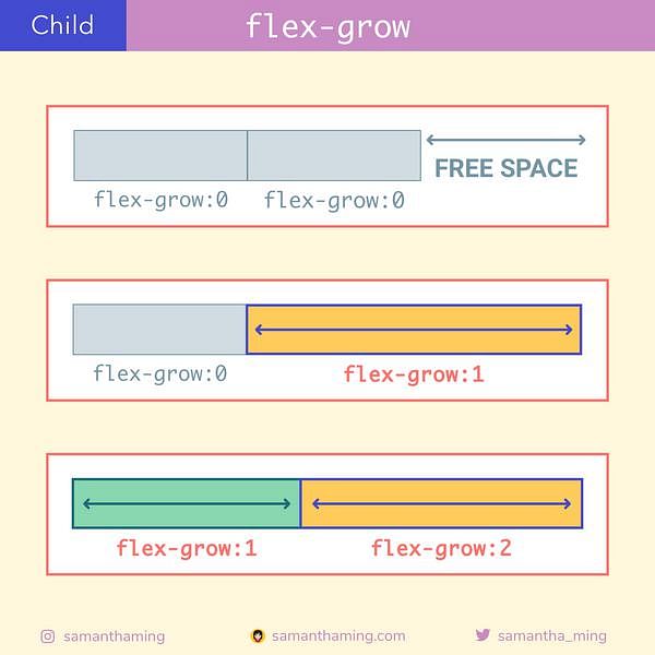
I mentioned in the beginning that Flexbox is great for responsive design. This is where it shines. The flex-grow property allows our flex item to grow if necessary. So if there is extra free space in my container, I can tell a particular item to fill it up based on some proportion. That's pretty nuts! When I was learning CSS, I remember everything is pretty static. Now with this property, it's like it has its own brain and it will adjust its size depending on the container. That's so great. I don't have to monitor the size. It will adjust accordingly. This was a quite the mind blow for me 🤯
.child {
  flex-grow: 0 /* default */
          or <number>
}