# Day 24: flex-shrink calculation
This is another optional knowledge. But if you're like me and is curious how the browser calculates flex-shrink. Join me in this rabbit hole 🐰
The math behind flex-shrink is a bit more complicated then flex-grow. You need to take into account of it's existing proportion and shrink it accordingly to the flex shrink amount. Hence, a few more calculation involved. Again, if this is throwing you off. Skip it. You don't need to know this to understand Flexbox. Luckily the browser takes care of it for you, how wonderful 😌
# Calculation
Indeed the calculation is a bit more complicated. But no worries, let's break it down we go through it step by step, you got this 💪
Here's the HTML and CSS we're working with:
HTML
<div class="parent">
  <div class="green"></div>
  <div class="yellow"></div>
</div>
CSS
.parent {
  width: 800px;
}
.green {
  width: 300px;
  flex-shrink: 4;
}
.yellow {
  width: 600px;
  flex-shrink: 6;
}
# Step 1: Breaking down the variables
This is the formula:
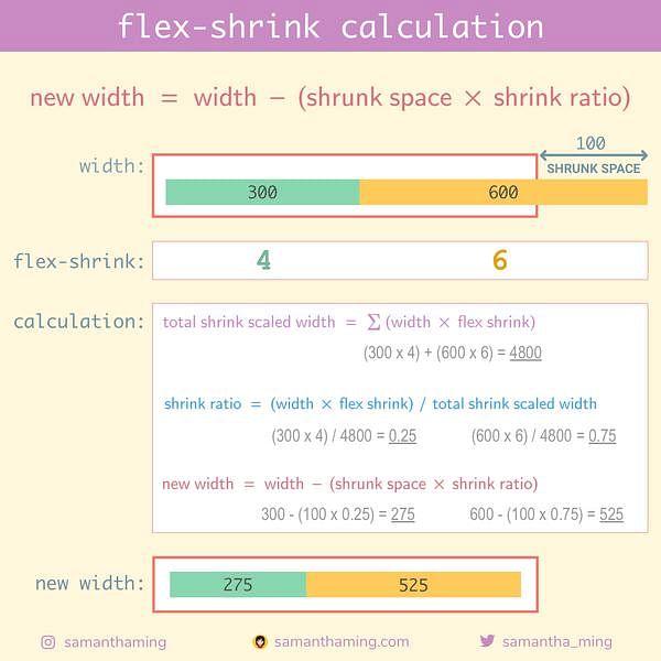
new width = width - (shrink space x shrink ratio)
Let's extract the variables required in the formula to this handy table we can fill in as we go:
| Variables | |
|---|---|
| width | need to calculate |
| shrink space | need to calculate |
| shrink ratio | need to calculate |
# Step 2: Fill in what we know
From the CSS value, we can conclude the following:
- The parent element (container) has a width of
800 - Green child element has a width
300andflex-shrinkof4 - Yellow child element has a width
600andflex-shrinkof6
Let's update our chart with this information:
| Green | Yellow | |
|---|---|---|
| flex shrink | 4 | 6 |
| width | 300 | 600 |
# Step 3: Calculate "shrunk space"
This is the formula:
shrunk space = total children widths - parent width
Remember what we know:
- The parent element (container) has a width of
800 - The child elements has a width of
300,600
Great, we can use that information to calculate "total children widths":
total children widths = green + yellow
                      = 300   + 600

=> 900
Now we can calculate our "shrunk space":
shrunk space = total children widths - parent width
             = 900                   -  800

=> 100
Let's update our chart and add the additional information:
| Green | Yellow | Total | |
|---|---|---|---|
| flex shrink | 4 | 6 | |
| width | 300 | 600 | |
| shrunk space | - | - | 100 |
# Step 4: Calculate "shrink ratio"
This is the formula:
shrink ratio = (width x flex shrink) / total shrink scaled width
Notice this new variable, total shrink scaled width. So we need to calculate that first to get our shrink ratio.
# Step 4-1: Calculate "total shrink scaled width"
This is the formula:
total shrink scaled width = Σ(width x flex shrink)
"Σ" Sigma is a math symbol that means the summation of something. So we need to apply width x flex shrink for all the child elements.
Green
width x flex shrink = 300 x 4

=> 1200
Yellow
width x flex shrink = 600 x 6

=> 3600
Finally
total shrink scaled width = 1200 + 3600

=> 4800
Let's add this information to our chart:
| Green | Yellow | Total | |
|---|---|---|---|
| flex shrink | 4 | 6 | |
| width | 300 | 600 | |
| shrunk space | - | - | 100 |
| total shrink scaled width | - | - | 4800 |
# Step 4-2: Back to calculating "shrink ratio"
Fantastic, now that we know the "total shrink scaled width", we can return with calculating the "shrink ratio". Remember the formula:
shrink ratio = (width x flex shrink) / total shrink scaled width
Green
shrink ratio = (300 x 4) / 4800

=> 0.25
Yellow
shrink ratio = (600 x 6) / 4800

=> 0.75
Let's add this information to our chart:
| Green | Yellow | Total | |
|---|---|---|---|
| flex shrink | 4 | 6 | |
| width | 300 | 600 | |
| shrunk space | - | - | 100 |
| shrink ratio | 0.25 | 0.75 |
# Final step: Calculate "new width"
Remember the formula:
new width = width - (shrink space x shrink ratio)
Green
new width = 300 - (100 x 0.25)

=> 275
Yellow
new width = 600 - (100 x 0.75)

=> 525
Done! We have successfully calculated the new width 🥳
| Green | Yellow | |
|---|---|---|
| width | 300 | 600 |
| shrunk space | 4 | 6 |
| shrink ratio | 0.25 | 0.75 |
| new width | 275 | 525 |